![]()
You may have been too busy building your empire to notice, but Facebook has snuck in a new Page look, complete with a cleaner, streamlined design and side navigation. While the changes won’t affect how post on your page, they will make it a bit easier for you to operate. Let’s take a quick look at what we can expect from the new Facebook Pages layout.
Cleaner cover photo
Profile pictures no longer interfere with the cover photo now that the profile pic is moved to the left-hand side. The cover photo now has a space all its own, while the profile picture is slightly larger in size. This means greater creativity when it comes to designing cover images: no more having to strategically place images with the overlapping profile picture and title text getting in the way.
Easier navigation
The new layout offers a simplified way to navigate, with the About, Photos, Posts, Likes and Videos links placed right below the profile picture in the left-hand column. You can manage this navigation by clicking the “Manage Tabs” link.
Search for posts!
 A simple way for your fans (or you!) to search for posts on your page by keywords or phrases – the search bar is conveniently located on the right-hand sidebar directly under the business category.
Keywords are searched in status updates, link titles, and link descriptions. All results show up in the body of the page, with your search words highlighted.
Like, Message and Share Buttons have new homes
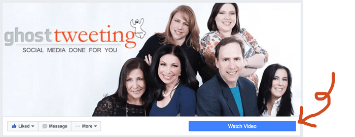
The Like, Message, and Share buttons find their new home directly under the cover photo to the left of the call-to-action button.
Improved call-to-action button
Speaking of buttons, one of the most prominent changes in the new layout is the call-to-action button. It’s much bigger, making it more visible to viewing audiences. Now found right under the cover photo, the CTA button is an essential when driving website traffic, sign-ups for newsletters, or leading a potential customer to your store. Changing your CTA button is easy peasy; just click “Edit Button,” and update your call-to-action as needed. Options include “Call Now,” “Shop Now,” “Request Appointment,” and “Send Email,” among others.

“About” is moved down
Now shifted to the right sidebar below the Category, Search Bar, and Likes section, the About tab where your company’s information is stored is now lower on the page. This is visible to page visitors when scrolling down your page.
View your page as a visitor
After all your page designing, it would be nice to know what the page looks like to others – without the private analytics and Facebook’s suggestions to promote your page. Now it’s easy! Simply hover on the “More” button under your cover photo, and then click “View as Page Visitor.” This is what your fans and visitors see when they are looking at your page.

So there you have it: Facebook Pages now comes with a cleaner look, easier navigation, and a focus on engaging with your audience. Take advantage of these changes today by getting acclimated with the new feel, and maybe spruce your own page up with a new cover photo or Call-to-Action button.
Now that your page looks so great, make sure you post custom, relevant, compelling content every day! Here’s the no-brainer solution to getting that done without any stress (The $97 No-Brainer Solution to Your Social Media Woes – custom Social Media content posted daily.)
Which part of the new Facebook Pages layout do you like best? Let us know on the new Ghost Tweeting Facebook Page or in the comments.

