LinkedIn has gotten a makeover, and it’s finally one seat closer to snagging a spot at the cool kids’ table. The network already holds the spot as the most popular way for professionals to connect, but with an updated interface reminiscent of Facebook, it also just got a lot more… social. The cleaner, faster, sleeker design is making it easier than ever to network with everyone from college alumni to prospective clients.
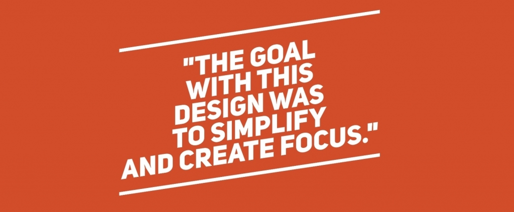
Amy Parnell, LinkedIn’s senior director of experience design notes that, “the goal with this design was to simplify and create focus.” What a better way to do that than to mimic the already successful Facebook model? “From a design perspective, you don’t want to create a whole new paradigm for how you interact with that model. If someone were to create a new email application, you would expect it to look and feel like email.” By giving users more of what they know, LinkedIn is making it easier for users to connect. Here are a few ways to navigate the newest features on LinkedIn.
A cleaner homepage
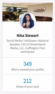
LinkedIn has cleared out the noise of its old clunky homepage and replaced it with a cleaner, quieter space. A snapshot of your profile is now in the upper left corner with profile views and headline shown directly under your photo, while a content sharing box is in the middle of the page for sharing articles, status updates and photos. This share box sits atop the newsfeed that flows down the middle of the page (not much of a change here, but the share box is nice and easy to find). On the right, you’ll find an ad card under a section entitled “what you need to know,” a space pretty much identical to Facebook’s trending topics.
New navigation bar features
The old navigation bar features are still alive and kicking, but they’ve been rearranged a bit. The old Home, My Network and Jobs tabs are still found atop the main page and what used to be the profile section is now simply titled “Me.” This updated circular Me icon in the upper right navigation bar allows you to view and edit your profile, adjust your privacy settings, and access the help center.
![]()
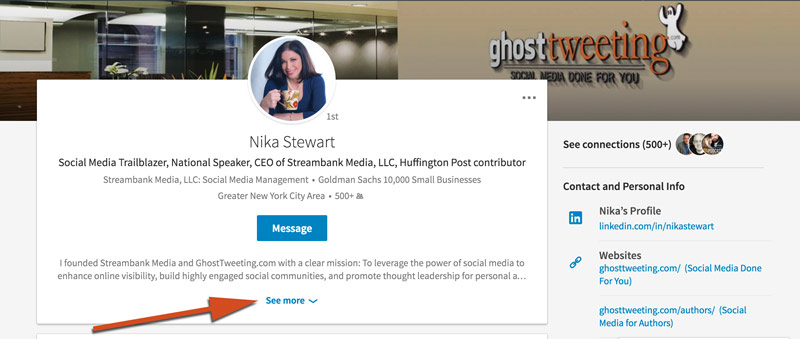
Fresh Profile Look
Your professional headline is centered at the top of the page, but viewers of your profile now have to click the “more” button to see more than just the first two lines of your summary, so it’s as important as ever to make those first lines count.
The background image dimensions are 1536 x 738. Your profile photo is smaller and circular. Because dimensions have changed and your profile pic is now round, you may want to look for different size photos for your page.
The content on the profile page has remained the same, but we can no longer move sections around.
Different way of searching
On the old LinkedIn, an advanced search – separate from the main search box – was required to get you the specific results you were after. In the new interface, you simply need to click on the magnifying glass icon inside the search box. Then you can narrow your search based on People, Jobs, Posts, Companies, or Groups, and if you need, most of the old search filters can be found along the right side of the page.
Making connections
The platform has made some changes when it comes to how users expand their network. When connecting from the “People You May Know” list, there is not an option of adding a personalized message. When it comes to declining invitations, there is only one option: Ignore. Gone is the “report invite as spam” option, and without the button right there, users are much less likely to go out of their way to report spammy invites. LinkedIn’s message here is clear: Make more connections!
After a quick bit of adjusting, users are finding this new interface much smoother than its older counterpart. The update will ultimately streamline the connection process on LinkedIn, and make our professional lives just a tad easier.
What are your biggest takeaways? What is the first thing you’ll do to optimize your new LinkedIn experience?